UX Lead & Strategist — Shaping products through research, design vision, and team empowerment
I partner with product, engineering, and business teams to define UX strategy, inspire design, and deliver meaningful outcomes. I lead with curiosity, mentorship, and data-driven decisions.

UX Leader | Mentor | Strategist
Who I Am / Philosophy
I’m a UX leader with over a decade of experience driving design maturity and delivering impactful products in complex domains (financial services, cybersecurity, enterprise platforms). I believe strong design emerges from curiosity, collaboration, and a willingness to revisit assumptions.
What I Do / How I Lead
I lead research initiatives, set design vision, and mentor teams to think holistically. I thrive at the intersections of user needs, business goals, and technical constraints. I champion user advocacy within organizations and help build processes that scale.
Impact & Differentiators
My skills
User research
User Testing
Wireframes
Prototypes
Mockups
User journeys
Story telling
Personas
Some thoughts on
User research
Research comes in many forms, but at its core, it’s all about understanding. It’s about gaining insights into the problem or situation you're aiming to solve. It's about understanding the users of the product and determining whether your solution effectively meets their needs. Testing helps to validate if your approach works for the intended audience.
Information archecture
Information architecture is all about the structure and flow of information. Everything has a hierarchy, and if that hierarchy is off, the product—whether it’s an app, website, or any other tool—becomes more difficult to use. While it may still be functional, users will face unnecessary challenges. By organizing the information correctly and breaking it into logical chunks, you make the experience much more intuitive. One of UX's key goals is to improve usability, and setting up the right information structure from the start is a crucial step in that direction.
Interaction design
Interaction design focuses on how users will engage with your product. This is where the creative side of UX really shines. After the research phase, it’s time to dive into the design process. Whether brainstorming alone or collaborating on a whiteboard, it’s about mapping out how users will interact with the product. Will they click a button? What kind of data will they see, and how much? Will they use touch or a mouse to navigate? These are just a few of the questions addressed during the interaction design phase. It’s where designs are iterated and refined to create the most user-friendly experience possible.
Telling the story
One of my favorite aspects of UX is telling the story. In fact, I believe it’s one of the most crucial elements of UX—and of any discipline, really. Telling the story is all about communication. Can you clearly convey your message to those who need to understand it? Can you make a compelling case for how the design will benefit the users? This is where storytelling becomes key. When presenting your ideas to executives, you need to be able to communicate the value of your design in a way that resonates with them. If you fail to tell the story, spark their interest, and demonstrate why the design should be implemented, no matter how great the design is, it may never get the approval it needs or make it to production.
My work
For privacy reasons, I’m unable to share my work from the past 5 years here. However, if you're interested in viewing more recent projects, feel free to reach out, and I’d be happy to provide a private link.
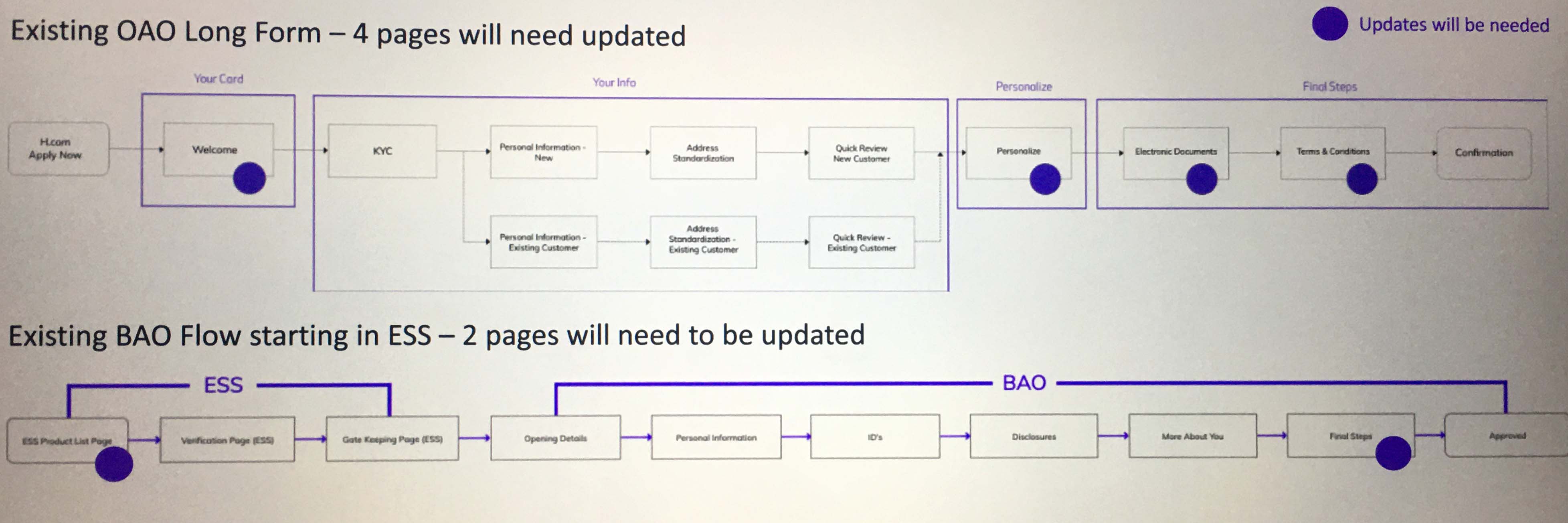
Wire Flows
Tasks performed: High Level Flow Design
These are some exaples of recent flows. These were used to identify pages that would be impacted by features of a new project.
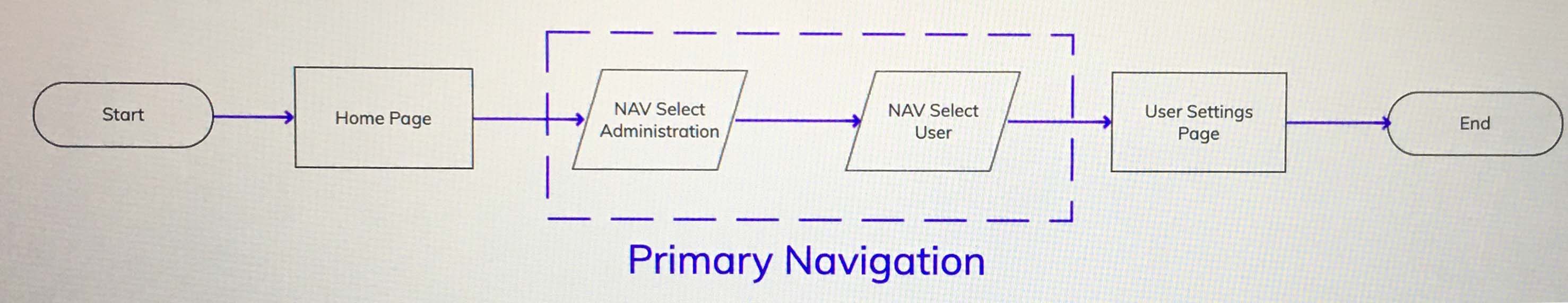
Tasks performed: High Level Flow Design
This is a simple flow to show navigation impacts to the user.
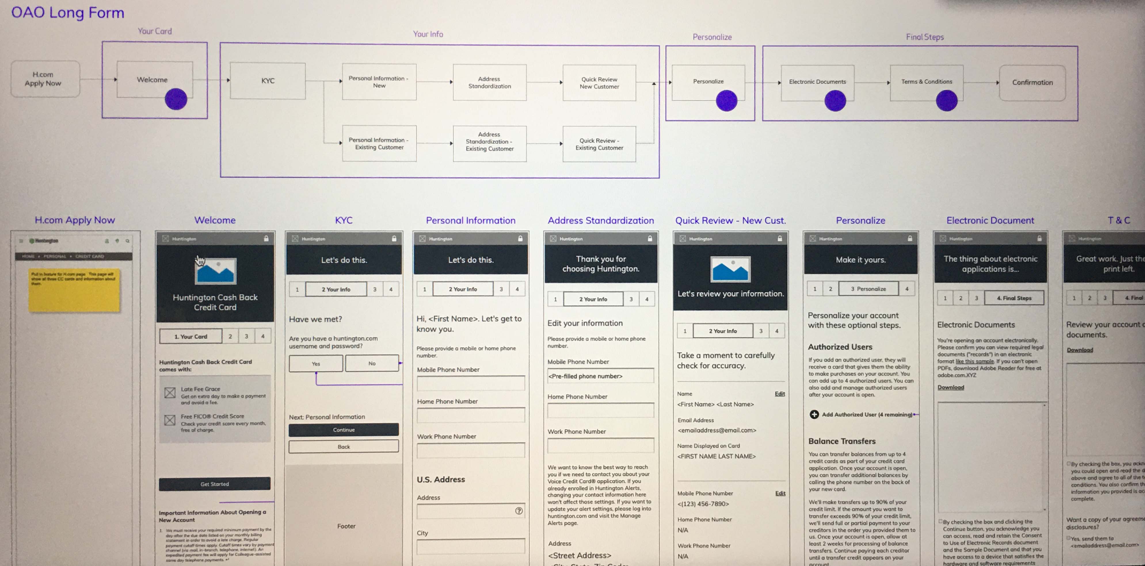
Tasks performed: Converting High Level Flow to Wireframes
Here I am showing the flow converted into wireframes.
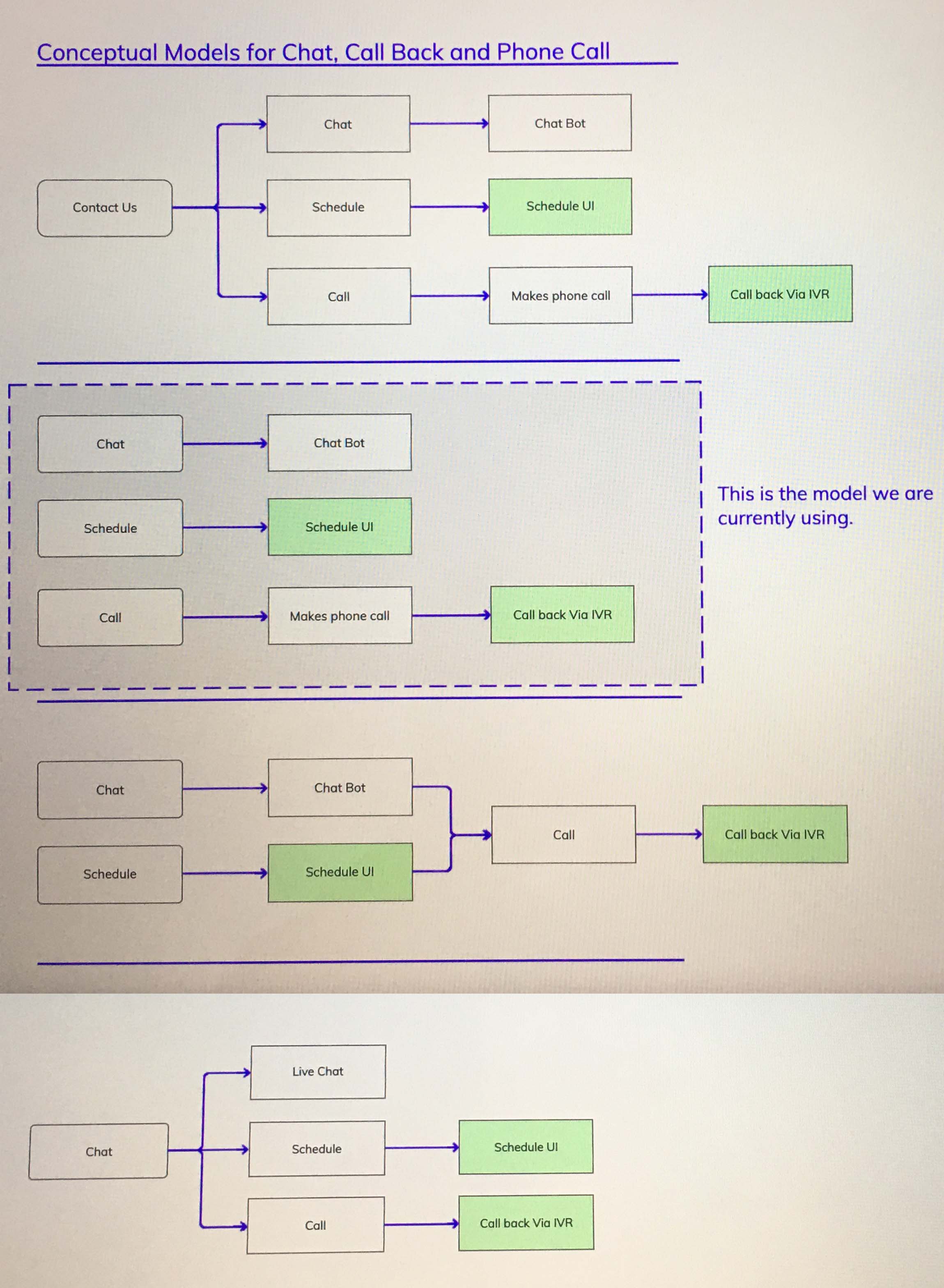
Conceptual Model
Tasks performed: Conceptual Model
I wired out concepts to show possible flows for Chat, Call Back & Phone Calls.
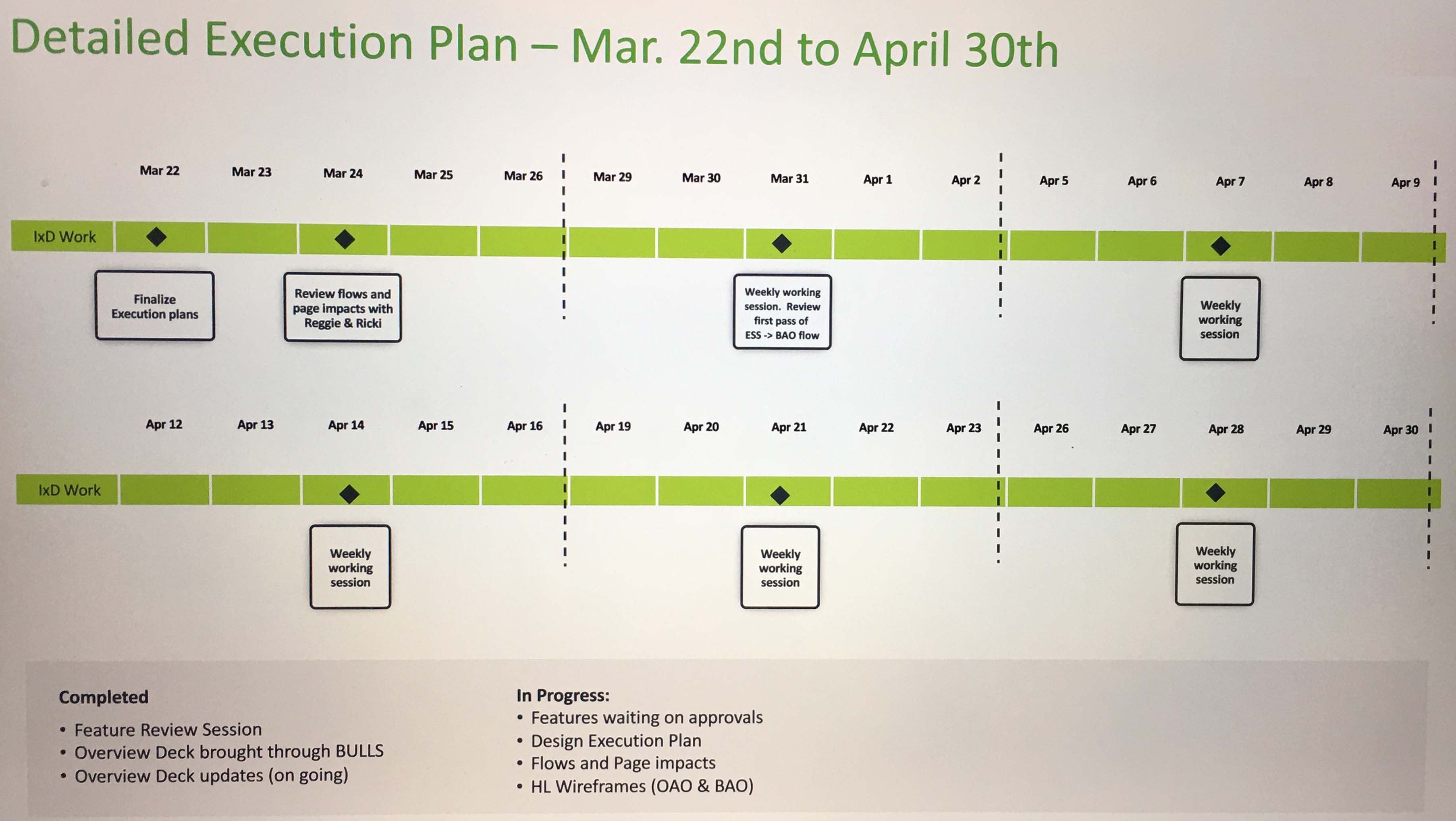
Project Planning
Tasks performed: Design Execution Plan
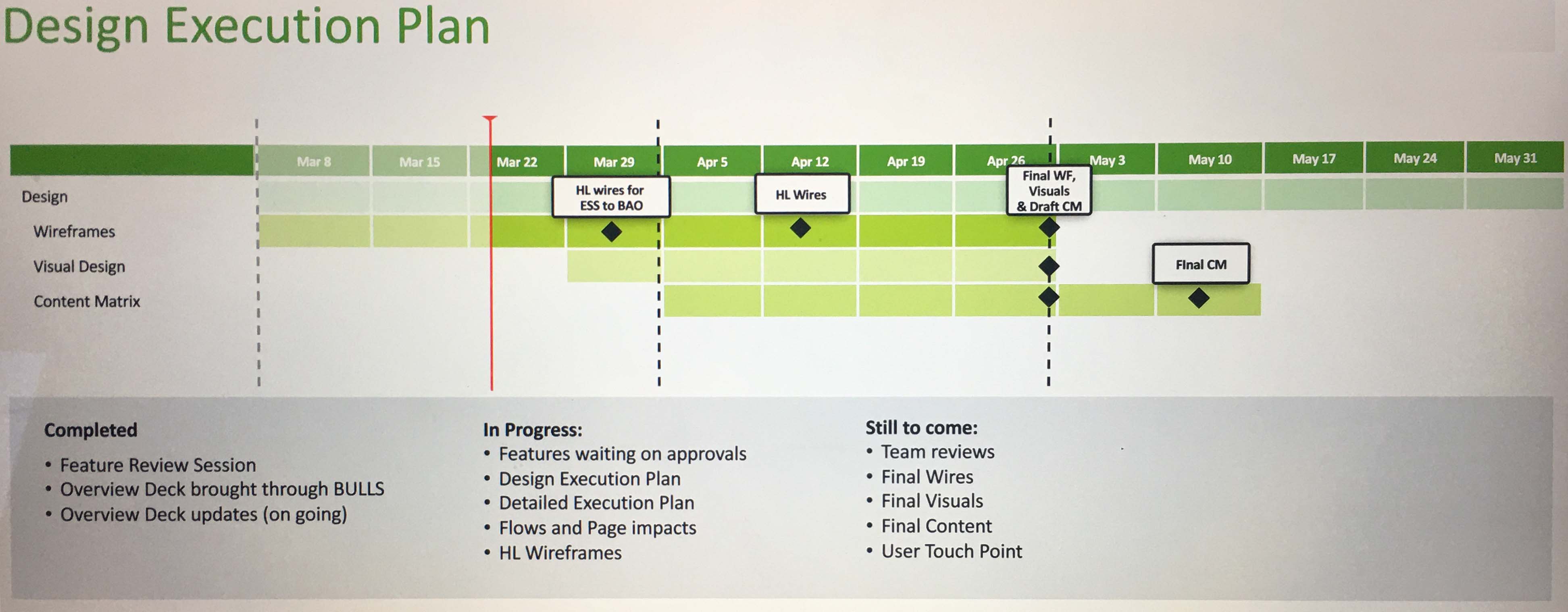
Tasks performed: Detailed Execution Plan
Visual to illustrate the UX process
Tasks performed: Informative Graphic
When my team starts a new project, it's common to find that people don’t fully grasp the role of UX. Many often assume that our job is simply to "make things look good." To clarify, I created this graphic, which I frequently use to explain the UX process and what it entails. It serves as a great introductory slide to align everyone and help them understand the value we bring to the table.

Design of Lunch Money Buddy App
Tasks performed: User journeys, site map, mockups, prototype
The design of the Lunch Money Buddy app was taken from concept though prototype. The ask for this project was to design a mobile application that parent could use to manage their childrens lunch money. The focus of the app was to allow parents to load funds, track how much each child had left in their account and also to show upcoming lunch menus.
First, user journeys were created to better understand how users might use this product. This journey walks Henry through adding funds to his son Joe's account. Henry gets an alert from the app. He opens the app to find that the alert was due to a low balance in Joe's account. Henry is quickly able to add funds from the checking account that he has previously stored in the app.


The next step was to start sketching out a possible site map to start to understand how the information would be organized. Hand sketched sitemaps were generated and then itterated through until a final version was created.


Now it was time to start to think through the screens of the app. Lots of versions of hand sketches were itterated through to think through the two main flows of adding funds to the account and viewing the upcoming schedule. A mobile template was used to sketch with. The basic interactions of the screens were thought through and sketched out.


Once the sketches were in a good place it was time to convert them to mockups. The hand sketches were turned into a more formal version that could be used for testing or communicating to the developers the proper design. For this project I created the prototype myself, but typically the mockups could have been handed off to developers. The benefit of having a prototpye is that testing could be performed to find errors on the design and changes made prior to giving the design to developement. Following are some sample screens of the mockups and a screen shot of the prototyped version of the app.


Information archecture rework of CoolTools.com
Tasks performed: Information archecture, mockups
CoolTools.com presented users with several different types of navigations. There was a main navigation for the parent site, a main navigation for the sub-site, a local navigation for the sub-site and finally an exact organization scheme for the content itself. It was even more confusing when a user would navigate to a specific section of the website.
There are several ways in which the organization of the site will be improved. The backpacking page is used as an example. One change is to move the main navigation of the Cool Tools site to the top of the page to provide some separation from the local "Categories" navigation. Organize the "Categories" into alphabetical order to take advantage of an exact organizational structure to make scanning the list easier. Move the "Month Selector" dropdown to tie it to the page elements a little better. Also, add a field label and show the default selection in the dropdown. This will better show how and what month the data is currently being sorted by. Add a date to each post above the title to show that the data is organized in chronological order. Add some styling to the "Archives" link as well as the "Backpacking" link to show where in the hierarchy of the site the user is.


Contact me
Delaware, OH
Phone: 740-803-4314
Email: joel.kidd@hotmail.com